Alert
Use an alert to communicate an important message to users.
Usage
An alert should be used to announce information that takes precedence over all other page content. The inclusion of role="alert" will assist screen readers in announcing this content ahead of other information, so this component should be used with caution.
There should be a maximum of one alert on a page at a time and it should be placed prominently above other page content.
Different colours of alert should be used to communicate different types of message.
<div class="sta-alert">
  <h2 class="sta-alert__heading">This is a default alert</h2>
  <div class="sta-alert__content sta-content">
    <p>This is some content for the alert.</p>
  </div>
</div>
Anatomy
An alert always consists of a heading and some content which are contained within a coloured box.
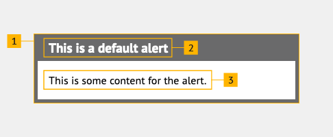
- Container
- Heading
- Content
Alert container
An alert container is rectangular and spans the full width of a layout. The colour of the border can be changed to suit the type of message the alert contains.
Alert heading
The heading spans the full width of the alert, with the background colour automatically matching that of the alert container border.
The heading should briefly describe the context for the alert. The heading level used should match the hierarchy of the surrounding content, for example if immediately following a page's <h1> then the alert heading should be a <h2>.
Alert content
The content should be directly related to the alert's heading. Content should be concise to prevent the alert dominating too large a proportion of the screen.
Links and buttons may be included in the content to direct users to perform actions that are directly related to the alert's heading.
Accessibility
The inclusion of role="alert" will assist screen readers in announcing this content ahead of other information, so this component should be used with caution.
Information alert
<div class="sta-alert sta-alert--info">
  <h2 class="sta-alert__heading">This is an information alert</h2>
  <div class="sta-alert__content sta-content">
    <p>This is some content for the alert.</p>
  </div>
</div>
Error alert
<div class="sta-alert sta-alert--danger">
  <h2 class="sta-alert__heading">This is an error alert</h2>
  <div class="sta-alert__content sta-content">
    <p>This is some content for the alert.</p>
  </div>
</div>
Success alert
<div class="sta-alert sta-alert--success">
  <h2 class="sta-alert__heading">This is a success alert</h2>
  <div class="sta-alert__content sta-content">
    <p>This is some content for the alert.</p>
  </div>
</div>
Warning alert
<div class="sta-alert sta-alert--warning">
  <h2 class="sta-alert__heading">This is a warning alert</h2>
  <div class="sta-alert__content sta-content">
    <p>This is some content for the alert.</p>
  </div>
</div>