Button
Buttons allow users to perform an action with a single tap.
Usage
Buttons communicate actions that users can take and typically will be used in interface locations such as forms, modals or dialog boxes.
- Buttons should be reserved for performing actions rather than linking to another page/section.
- The text used on a button must be sentence case and describe the action to be performed, for example 'Submit application' or 'Save and continue'.
Hierarchy
Different types of button can be used to assign varying levels of importance:
- Action button
- Highest importance
- Solid button
- High importance
- Outline button
- Medium importance
- Text button
- Low importance
Icons
Each of the button types may also have an optional icon included. Icons are taken from the Outlined set of the Material icons library and are assigned to a button by specifying the textual name of the icon in the data-icon attribute.
Anatomy
A button always consists of a text label in a padded container.
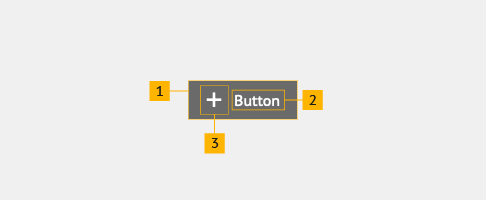
- Container
- Text label
- Optional icon
Button container
A button container is rectangular and contains the contents of the button, adapting to the width of the contents. Border, background and padding is consistent across all types of button, however colours may be transparent in some cases.
Button text label
A button should always have a text label. This must be in sentence case and describe the action that the button will perform.
Optional button icon
An icon may be placed in front of the text label to provide additional visual cues as to what the button action is.
Behaviour
All buttons should follow a consistent approach to interation regardless of style:
- Hover
- Background colour change, where the colour is relative to the button type and theme. Underline is removed from text button.
- Focus
- Orange highlight outline applied regardless of button type and theme. Underline is added to text label if not already present.
- Active
- Orange highlight background, dark grey underlined text label and dark grey optional icon are applied regardless of button type and theme.
Accessibility
The <button> tag has native support for keyboard, mouse and touch users, if using a link as a button you should add role="button" to the <a> tag. More information on the ARIA button role can be found on the Mozilla developers website.
All buttons follow a consistent set of interactive styles for their various states. The distinctive focus and active states make it clear for keyboard users when interaction has occurred. More information on focus states can be found on the Digital Communications team blog.
Solid button
<button class="sta-button">Button</button>
<button class="sta-button sta-button--icon" data-icon="add">Button</button>
Outline button
<button class="sta-button-outline">Button</button>
<button class="sta-button-outline sta-button--icon" data-icon="shopping_basket">Button</button>
Text button
<button class="sta-button-text">Button</button>
<button class="sta-button-text sta-button--icon" data-icon="delete">Button</button>
Action button
The action button is larger and more prominent than all other buttons and has the highest importance in the visual hierarchy. The secondary action button can be used in combination if additional buttons are required.
- If used in a design, the action button should be the most important call to action.
- The action button should only be used once per page. Use secondary action buttons if more are needed alongside this.
- For further information on combining buttons, see button grouping.
- The action button icon is always placed to the right of the text label. No other icon may be used.
<button class="sta-button-action">Action button</button>
<button class="sta-button-action-secondary">Secondary action button</button>
Small button
Buttons are available in a smaller size for all types of button, with the exception of action buttons, by including the .sta-button--small class. This is useful for buttons that are not intended to be the primary focus of the user interface.
<div class="sta-button-group">
  <button class="sta-button sta-button--small">Solid button</button>
  <button class="sta-button-outline sta-button--small">Outline button</button>
  <button class="sta-button-text sta-button--small">Text button</button>
  <button class="sta-button sta-button--icon sta-button--small" data-icon="add">Icon solid button</button>
  <button class="sta-button-outline sta-button--icon sta-button--small" data-icon="shopping_basket">Icon outline button</button>
  <button class="sta-button-text sta-button--icon sta-button--small" data-icon="delete">Icon text button</button>
</div>Theming
Alternate colour palettes can be applied to buttons to match your design.
<div class="sta-margin--small-bottom sta-font-emphasis--low">// Green</div>
<div class="sta-button-group">
  <button class="sta-button sta-button--alt-theme-1">Solid button</button>
  <button class="sta-button-outline sta-button--alt-theme-1">Outline button</button>
  <button class="sta-button-text sta-button--alt-theme-1">Text button</button>
  <button class="sta-button sta-button--icon sta-button--alt-theme-1" data-icon="logout">Icon solid button</button>
  <button class="sta-button-outline sta-button--icon sta-button--alt-theme-1" data-icon="search">Icon outline button</button>
  <button class="sta-button-text sta-button--icon sta-button--alt-theme-1" data-icon="home">Icon text button</button>
</div>

<div class="sta-margin--small-v sta-font-emphasis--low">// Purple</div>
<div class="sta-button-group">
  <button class="sta-button sta-button--alt-theme-2">Solid button</button>
  <button class="sta-button-outline sta-button--alt-theme-2">Outline button</button>
  <button class="sta-button-text sta-button--alt-theme-2">Text button</button>
  <button class="sta-button sta-button--icon sta-button--alt-theme-2" data-icon="face">Icon solid button</button>
  <button class="sta-button-outline sta-button--icon sta-button--alt-theme-2" data-icon="settings">Icon outline button</button>
  <button class="sta-button-text sta-button--icon sta-button--alt-theme-2" data-icon="account_circle">Icon text button</button>
</div>

<div class="sta-margin--small-v sta-font-emphasis--low">// Burgundy</div>
<div class="sta-button-group">
  <button class="sta-button sta-button--alt-theme-3">Solid button</button>
  <button class="sta-button-outline sta-button--alt-theme-3">Outline button</button>
  <button class="sta-button-text sta-button--alt-theme-3">Text button</button>
  <button class="sta-button sta-button--icon sta-button--alt-theme-3" data-icon="description">Icon solid button</button>
  <button class="sta-button-outline sta-button--icon sta-button--alt-theme-3" data-icon="done">Icon outline button</button>
  <button class="sta-button-text sta-button--icon sta-button--alt-theme-3" data-icon="info">Icon text button</button>
</div>

<div class="sta-margin--small-v sta-font-emphasis--low">// Default - no colour theme</div>
<div class="sta-button-group">
  <button class="sta-button sta-button--alt-theme-4">Solid button</button>
  <button class="sta-button-outline sta-button--alt-theme-4">Outline button</button>
  <button class="sta-button-text sta-button--alt-theme-4">Text button</button>
  <button class="sta-button sta-button--icon sta-button--alt-theme-4" data-icon="favorite_border">Icon solid button</button>
  <button class="sta-button-outline sta-button--icon sta-button--alt-theme-4" data-icon="visibility">Icon outline button</button>
  <button class="sta-button-text sta-button--icon sta-button--alt-theme-4" data-icon="fingerprint">Icon text button</button>
</div>